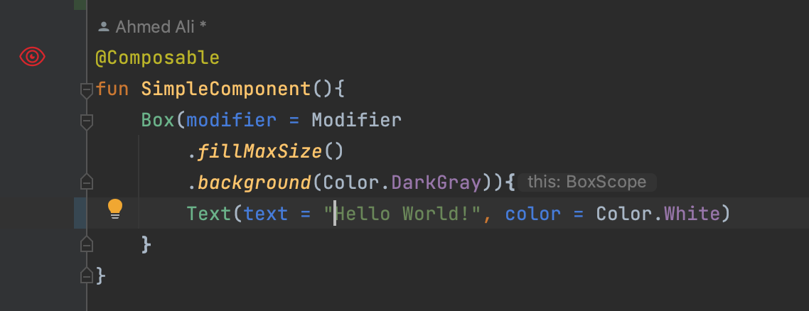
While experimenting with IntelliJ-based IDEs, especially Android Studio, I embarked on creating a feature to add an icon next to the declaration of compose functions with a specific action. The idea was to visually enhance the coding environment for better recognition and interaction with composable functions.
Starting Point: Creating a LineMarkerProvider
The initial step was to implement a LineMarkerProvider, essential for marking specific lines or elements in the editor with an icon.
class ComposableFunctionLineMarkerProvider : LineMarkerProvider {
    override fun getLineMarkerInfo(element: PsiElement): LineMarkerInfo<*>? {
        if (shouldHaveMarker(element)) {
            // Implementation details...
        }
        return null;
    }
}
This custom LineMarkerProvider needed to be registered within plugin.xml to be recognized and utilized by the IDE.
<extensions defaultExtensionNs="com.intellij">
    <codeInsight.lineMarkerProvider
            language="kotlin"
            implementationClass="your.full.class.path"/>
</extensions>
Identifying Composable Functions
The core functionality revolves around accurately identifying composable functions. This involves analyzing PSI (Project Structure Interface) elements to find functions annotated with @Composable.
private fun shouldHaveMarker(element: PsiElement): Boolean {
    if (element !is KtNamedFunction) {
        return false;
    }
    return element.annotationEntries.any { it.shortName?.asString() == "Composable" };
}
It’s important to note that we search for annotations by their short name, avoiding the complexity of resolving the full qualified name at this stage.
Displaying the Icon
Upon identifying a composable function, the next step is to create and display the LineMarkerInfo object, which includes the icon and its positioning.
override fun getLineMarkerInfo(element: PsiElement): LineMarkerInfo<*>? {
    if (shouldHaveMarker(element)) {
        return LineMarkerInfo(
            element,
            element.textRange,
            MyIcon,
            null, // Tooltip text
            null,
            GutterIconRenderer.Alignment.RIGHT, // Icon alignment
            { "Supplier" }
        );
    }
    return null;
}
This implementation ensures that the icon appears next to composable functions within the IDE, enhancing visual identification.
Enhancing Interactivity with CustomLineMarkerInfo
To introduce actionable capabilities to the icon, I extended LineMarkerInfo into CustomLineMarkerInfo, incorporating an action group for interactivity.
class CustomLineMarkerInfo(
    element: PsiElement,
    icon: Icon,
    private val myActionGroup: DefaultActionGroup
) : LineMarkerInfo<PsiElement>(
    element,
    element.textRange,
    icon,
    null,
    null,
    GutterIconRenderer.Alignment.CENTER,
    { "Supplier" }
) {
    override fun createGutterRenderer(): GutterIconRenderer? {
        return object : LineMarkerGutterIconRenderer<PsiElement>(this) {
            override fun getClickAction(): AnAction? { return null; }

            override fun isNavigateAction(): Boolean { return true; }

            override fun getPopupMenuActions(): ActionGroup? { return myActionGroup; }
        };
    }
}
Final look
Here’s how it looks it at end:
